CMU HCII is hiding important information from potential capstone sponsors.
Securing industry partnerships for MHCI capstone projects, connecting student teams with real-world design challenges and professional mentorship opportunities.
Role
UX Researcher & Designer
Timeline
January 2025 - April 2025
Skills
Data Analysis
Visualizations
Research Reports
Usability Testing
Wireframing
Prototyping
Tools
Excel
Tableau
Figma
CONTEXT
How might we transform industry leaders' initial interest in our program into committed capstone sponsorships that benefit both companies and student teams?
THE CHALLENGE
The current MHCI Capstone page creates friction for potential industry partners by burying critical partnership information beneath content designed for prospective students. Industry decision-makers cannot easily find the specific information they need to evaluate sponsorship opportunities, reducing conversion rates from page visits to committed partnerships.
DATA STORY
I analyzed data outlining traffic, click-through rates, heat maps, and more. I created data visualizations comparing LinkedIn page visitors vs. actual capstone partners.

This visualization shows that Financial Services has the lowest engagement,, with 234 visitors, but has the second highest number of capstone partnerships.

This visualization shows that Design Services has the highest engagement, with 1250 visitors, but zero capstone partnerships.
KEY INSIGHT
Our potential partners are showing interest but not converting. The disconnect happens both in our social media strategy and in how partnership information is presented on our website.
USABILITY TESTING
Approach
I conducted usability tests with 4 industry professionals who match our partner profile.
The tests were focused on partnership information finding, navigation, and contact initiation.
I measured user satisfaction with the SUS survey + recorded key pain points.
Findings
Lack of separation between student and sponsor content creates confusion
Critical information (costs, timeline, commitment) is missing or hard to find
The text on the page takes too much effort to parse
Contact process feels cumbersome and unclear
Metrics
3 on ease of use, which suggests it was a mediocre experience.
SUS Survey score was 62, which means it had below average usability.
REFINED FOCUS
How might we create clear pathways that reduce cognitive load for potential industry partners trying to navigate from initial interest to committed partnership?
DESIGNING FOR USERS
LANDING PAGE
This page provides information for both sponsors and students, but it is confusing to differentiate between them.
Two users attempted to click the 'Apply Now' button, not realizing it was meant for students.
CURRENT DESIGN

PROPOSED DESIGN
Splitting the content at the top of the page between sponsors and students means that people don’t have to manually filter what applies to them.

SPONSOR PAGE
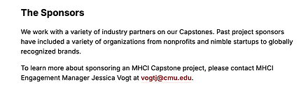
CURRENT DESIGN
The information provided in the current section targeted towards potential sponsors is insufficient.
PROPOSED DESIGN
There should be a separate page specifically for sponsors that provides them with the information they need that is going to increase conversion to become capstone partners.
This page should be broken up in a way that reduces the users’ cognitive load as they scan through the page. I suggest adding visuals, interactive elements, and clear CTAs.
A few participants mentioned that the timeline wasn't clear in the current design, as it was for students
"I want to be able to see the logos of companies that HCI has worked with without having to look for it" - CTO, 52
The process of applying to be a sponsor & the link to the form are not in the current design

IMPACT & RESULTS
WHAT DID I FIX?
1
2
3
4
This design separated student and sponsor content to reduce confusion and cognitive load.
I developed a visual timeline showing partnership process, costs, and commitment expectations.
Using the addition of the form, I replaced confusing email exchanges with direct scheduling functionality.
I created a visual section, helping users discover relevant past projects.
EXPECTED OUTCOMES
SUS score improvement from current 62 (below average) to target of 80+.
Higher conversion rates, particularly from high-interest industries like design services.
More diverse industry partnerships creating richer student experiences.
Help increase CMU MHCI's brand reputation.
REFLECTING
Mixed methods was the key to this project. The LinkedIn data caught my attention with design services showing massive interest (1,250 visitors) but zero partnerships - something I wouldn't have spotted through just interviews.
Testing with industry professionals then revealed why: the site was literally preventing conversions through its confusing organization. People couldn't find what they needed even when they were interested.
This natural tension between quantitative patterns and qualitative understanding continues to shape how I approach design problems.
My Research Diary

I'd love to A/B test these designs and see which specific changes most effectively turn visitors into partners. The visual timeline? The direct scheduling? There's still more to learn here.